


「AIで図解を作ってみたけれど、文字がグチャグチャで使い物にならない」
「レイアウトが崩れて、結局自分でパワポを引き直した」
AIを活用して仕事の効率化や発信力を高めようとしている方の多くが、この「ビジュアル構造の壁」にぶつかっています。
AIは、テキストを生成する能力においてはもはや人間を凌駕しつつあります。
しかし、いざ「図解にして」と頼んだ途端、その知能は急激に低下したかのような出力を返してくることがあります。
なぜ、これほどまでにAIは「図」に弱いのでしょうか?
その理由は、AIが「空間認識」と「言語」を別々の回路で処理しているからに他なりません。
私たちが日本語で「マトリクスを作って」と頼んでも、AIの内部では日本語のニュアンスと、マトリクスという複雑な空間配置がうまく結びつかないのです。
もし、あなたが「とりあえずのプロンプト」を使い続けているなら、それは暗闇で目隠しをして絵を描かせているようなものです。
図解生成の新基準「NanobananaPro」の衝撃
私はこれまで、AI出版プロデューサーとしての実践を通じて、数千回におよぶプロンプト検証を繰り返してきました。
その結果辿り着いたのが、今回ご紹介する「NanobananaPro(ナノバナナ・プロ)」というツールを活用するためのプロンプトです。
この手法の核心は、「バイリンガル・ハイブリッド記述」にあります。
AIの設計図となる「構造(Layout)」や「視覚要素(Visuals)」は、AIが最も深く、かつ厳密に理解できる英語で定義する。一方で、実際に図の中に書き込ませる「内容(Text content)」は日本語で指定する。
この「役割分担」を行うだけで、AIの空間認識能力は飛躍的に向上し、日本語の文字崩れを最小限に抑えながら、意図した通りの配置で図解を出力させることが可能になります。
なぜ「英語構造 × 日本語内容」が最強なのか?
現在の主要なAIモデル(DALL-E 3、Midjourney、Gemini等)は、膨大な英語圏のデータをベースに学習されています。そのため、以下の特性を持っています。
- 空間指示の解像度:
- “Top-Left”, “Central hub”, “2×2 grid” といった英語の指示は、日本語の「左上」「中央」「2×2の表」という指示よりも、AIのイメージ生成領域に対して圧倒的に高い精度で作用します。
- “Top-Left”, “Central hub”, “2×2 grid” といった英語の指示は、日本語の「左上」「中央」「2×2の表」という指示よりも、AIのイメージ生成領域に対して圧倒的に高い精度で作用します。
- 文脈の切り分け:
- プロンプトを英語の「タグ」で構造化することで、AIは「どこがデザインの指示で、どこが書き込むべきテキストか」を明確に区別できるようになります。
「NanobananaPro」は、この特性をハックし、誰でもプロ級の図解を生成できるように体系化した仕組みです。
これから紹介する24種類の図解パターンは、すべてこの「NanobananaPro」形式で最適化されています。この「図解の辞書」を手に入れることで、あなたの発信は、言葉を超えた説得力を持つようになります。
第2部:24種の「神図解」プロンプト図鑑 Vol.1
1. ツリー図(Tree Diagram)
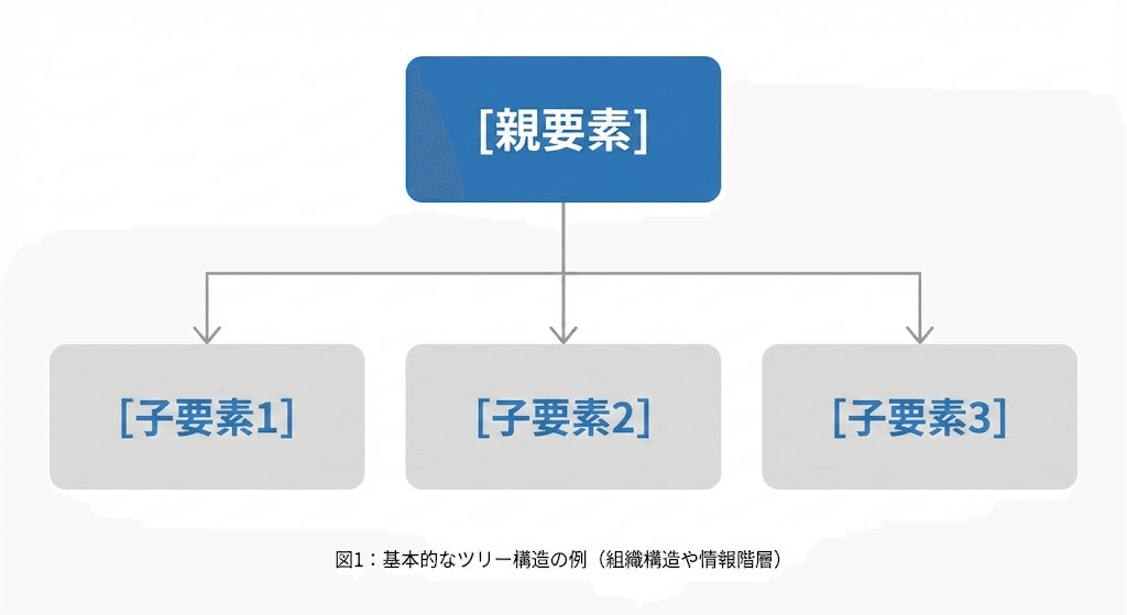
階層構造を整理し、複雑な要素を「グループ化」して示すのに最適です。
- メリット: 大まかな全体像から詳細へと、視線をスムーズに誘導できます。
- NanobananaPro Prompt:
Plaintext
* Subject: (Professional infographic of a Tree Diagram with Japanese text.)
* Layout: (Hierarchical tree structure. Top node is "[親要素]". Branches lead down to three sub-nodes: "[子要素1]", "[子要素2]", "[子要素3]".)
* Visuals: (Minimalist flat design. Rectangular boxes with soft rounded corners. Connection lines are clean and thin. Color palette: Corporate blue and gray.)
* Style: (Modern UI, white background, high-quality Japanese typography.)
2. ピラミッド図(Pyramid Diagram)
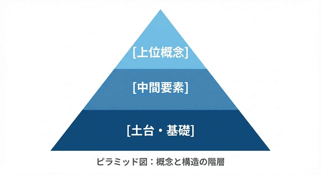
「下が土台、上が上位概念」という関係を直感的に伝えます。
- メリット: 優先順位や、何が基礎となっているのかを一目で理解させます。
- NanobananaPro Prompt:
Plaintext
* Subject: (Infographic of a Pyramid Diagram with Japanese text.)
* Layout: (A large triangle divided into 3 horizontal layers. Top layer: "[上位概念]", Middle layer: "[中間要素]", Bottom layer: "[土台・基礎]".)
* Visuals: (Gradient colors from bottom to top. Dark blue base to light blue top. Bold Japanese fonts centered in each layer.)
* Style: (Clean, flat vector, professional presentation style, white background.)
3. マトリクス(Matrix)
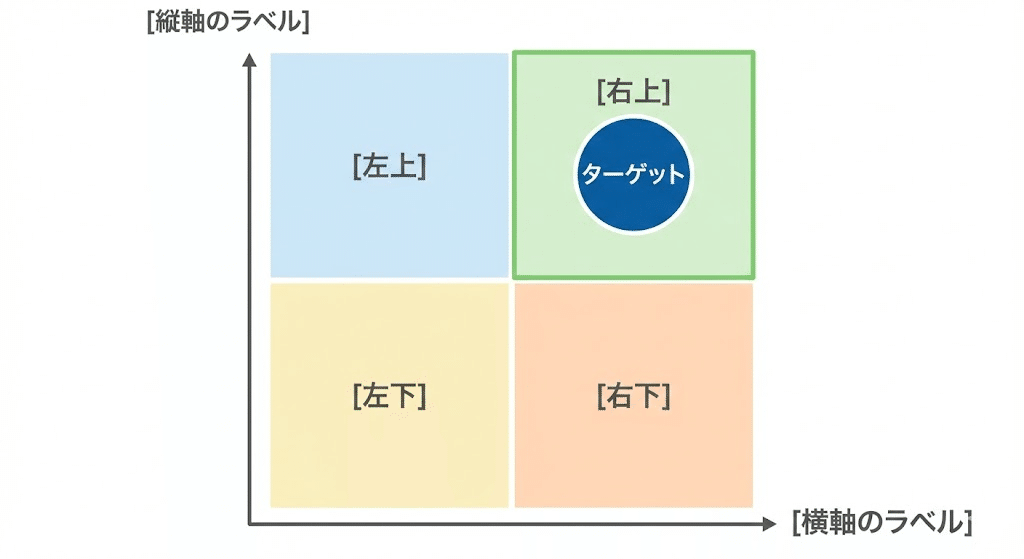
2つの軸で要素を分類し、現状のポジショニングを明確にします。
- メリット: 空いている象限を見せることで、「攻めどき」や「独自性」を強調できます。
- NanobananaPro Prompt:
Plaintext
* Subject: (Professional 2x2 Matrix chart with Japanese text.)
* Layout: (A large square divided into four quadrants by two perpendicular axes. Vertical axis: "[縦軸のラベル]", Horizontal axis: "[横軸のラベル]".)
* Visuals: (Each quadrant has a distinct light pastel background. Labels: [右上], [左上], [右下], [左下]. High contrast for the target quadrant.)
* Style: (Business style, minimalist, high resolution, vector illustration.)
4. ベン図(Venn Diagram)
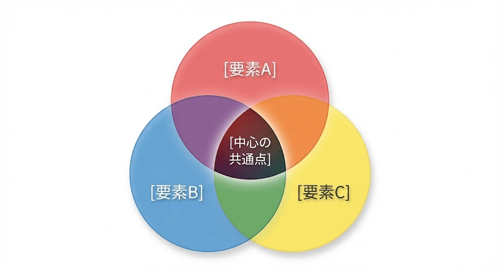
複数の要素が重なり合う「共通点」を直感的に示します。
- メリット: 「自分にしかできない領域(USP)」を視覚化する際に強烈な説得力を持ちます。
- NanobananaPro Prompt:
Plaintext
* Subject: (Venn Diagram with three overlapping circles and Japanese text.)
* Layout: (Three circles labeled A, B, and C. Center overlap is highlighted. Text labels: "[要素A]", "[要素B]", "[要素C]", and "[中心の共通点]".)
* Visuals: (Translucent colors (Red, Blue, Yellow). The overlapping areas create subtle new color tones. Soft drop shadows.)
* Style: (Elegant, clean design, professional Japanese sans-serif font, white background.)
5. 放射図(Radial Diagram)
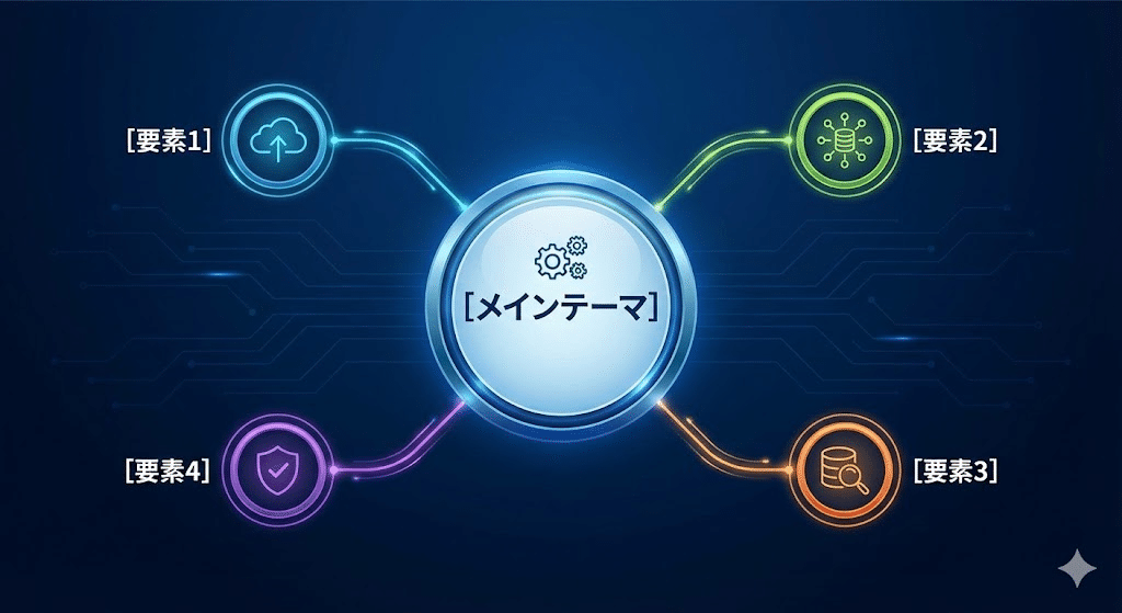
中心からの広がりや、主題が与える影響の伝播を視覚化します。
- メリット: 視線を中央に集めやすいため、最も伝えたい「核」を強調できます。
- NanobananaPro Prompt:
Plaintext
* Subject: (Radial/Mind-map style infographic with Japanese text.)
* Layout: (Central circle containing "[メインテーマ]". Multiple lines radiating outward to 4 circles: "[要素1]", "[要素2]", "[要素3]", "[要素4]".)
* Visuals: (Vibrant colors for each branch. Thin, curved connecting lines. Professional icons next to each sub-element.)
* Style: (Modern tech style, clean layout, high definition, Japanese typography.)
6. フロー図:横型(Horizontal Flow)
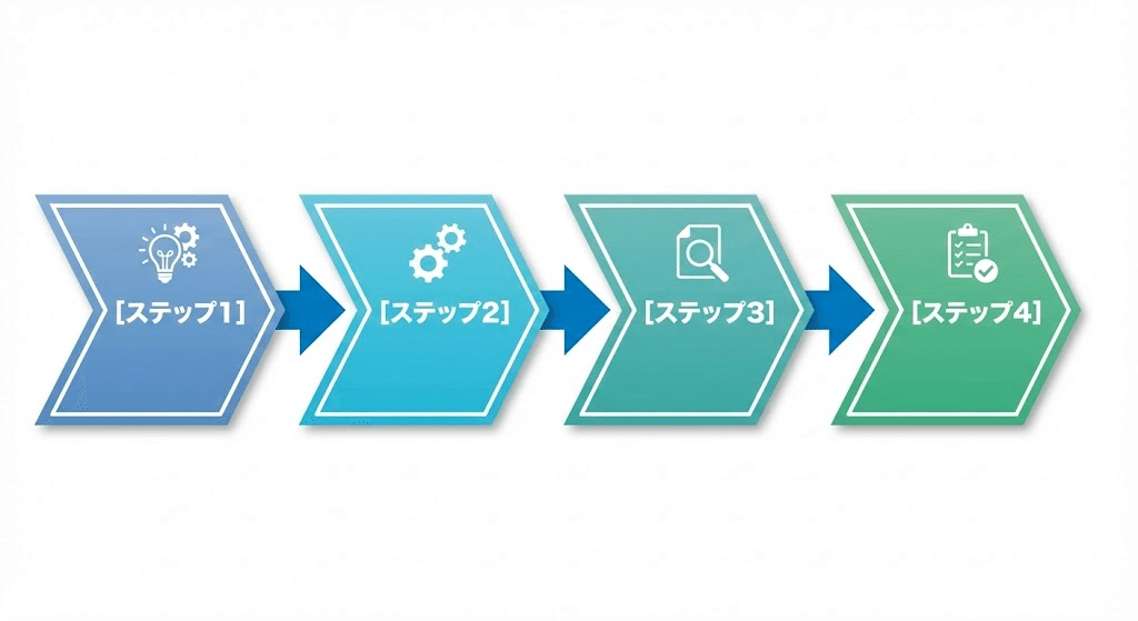
左から右への自然な視線誘導で、プロセスの流れを追いやすくします。
- メリット: 特にスライド資料など、横長のスペースを有効活用する際に便利です。
- NanobananaPro Prompt:
Plaintext
* Subject: (Horizontal Flow Chart showing a process with Japanese text.)
* Layout: (Linear progression from left to right. 4 main steps connected by bold arrows: "[ステップ1]", "[ステップ2]", "[ステップ3]", "[ステップ4]".)
* Visuals: (Chevron-shaped boxes for each step. Cohesive color palette. High-quality icons above each step label.)
* Style: (Professional, sleek, flat design, white background, Japanese font.)
7. フロー図:縦型(Vertical Flow)
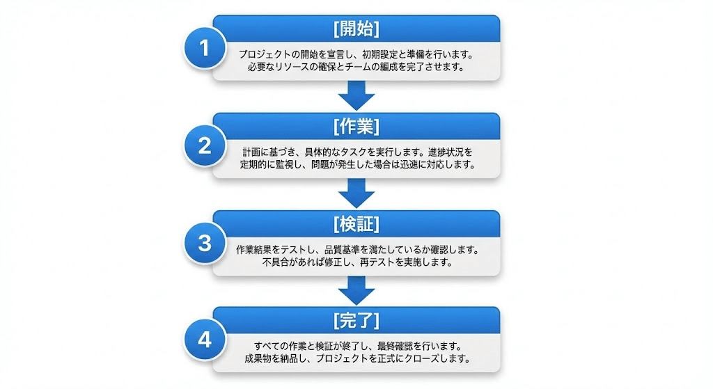
各ステップの詳細を書き込みたい場合や、スマホで閲覧される記事に適しています。
- メリット: 縦にスクロールするSNSやnoteとの相性が抜群に良い図解です。
- NanobananaPro Prompt:
Plaintext
* Subject: (Vertical Flow Chart process with Japanese text.)
* Layout: (Top-to-bottom vertical progression. Boxes connected by downward arrows: "[開始]", "[作業]", "[検証]", "[完了]".)
* Visuals: (Numbered bullets (1, 2, 3...) next to each box. Detailed sub-text in a smaller Japanese font inside the boxes.)
* Style: (Clean UI design, professional, white background, high resolution.)
8. サイクル図(Cycle Diagram)
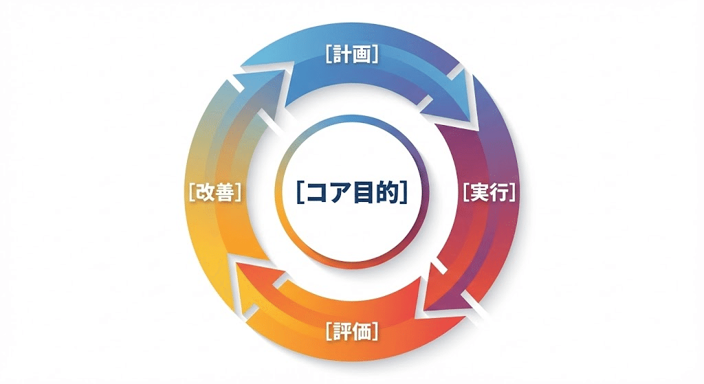
PDCAや運用の改善など、「繰り返し」のプロセスを表現するのに最適です。
- メリット: 終わりがない継続的な価値提供や、成長のループを印象づけます。
- NanobananaPro Prompt:
Plaintext
* Subject: (Circular Cycle Diagram with Japanese text.)
* Layout: (Continuous circular arrow loop consisting of 4 segments: "[計画]", "[実行]", "[評価]", "[改善]". Center contains "[コア目的]".)
* Visuals: (Gradient colors along the circle. Smooth arrows showing clockwise movement. Bold Japanese text centered in segments.)
* Style: (Modern vector, professional look, high resolution, white background.)
9. ビフォーアフター(Before & After)
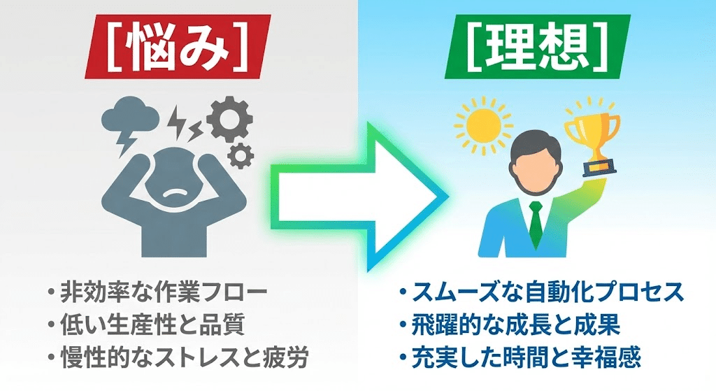
導入前と後のコントラストを出し、サービスの価値を最大化させます。
- メリット: 読者が抱える「悩み」と、手に入る「未来」の差を視覚的に叩き込みます。
- NanobananaPro Prompt:
Plaintext
* Subject: (Before and After comparison infographic with Japanese text.)
* Layout: (Split-screen. Left side "Before" showing "[悩み]", Right side "After" showing "[理想]". Large arrow pointing right.)
* Visuals: (Left: Dull gray tones with a negative icon. Right: Bright vibrant tones with a success icon. High contrast.)
* Style: (Bold typography, high-impact visuals, flat design, professional Japanese font.)
10. 項目比較図(Comparison Chart)
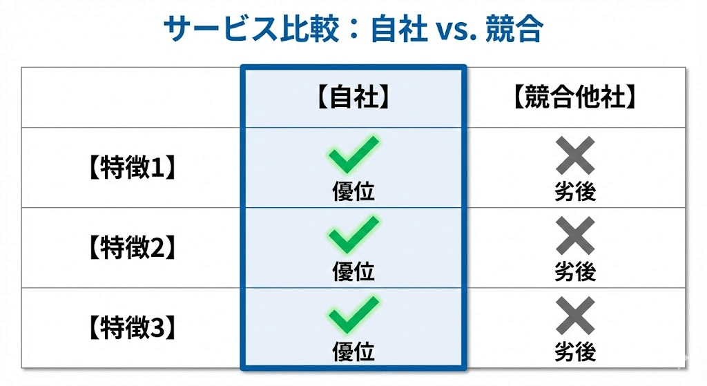
他社との違いや、プランごとの差を明確に打ち出すための図解です。
- メリット: 「どこが違うのか」を強調することで、購入時の迷いを払拭します。
- NanobananaPro Prompt:
Plaintext
* Subject: (Comparison chart between Two Services with Japanese text.)
* Layout: (A grid comparing "Self" and "Competitor" across 3 features: "[特徴1]", "[特徴2]", "[特徴3]". Self column is highlighted.)
* Visuals: (Bright checkmarks for Self, gray 'X' marks for Competitors. Highlighted column with a bold border.)
* Style: (Corporate style, clean lines, easy-to-read Japanese, professional.)
11. 階段・ステップ図(Staircase Diagram)
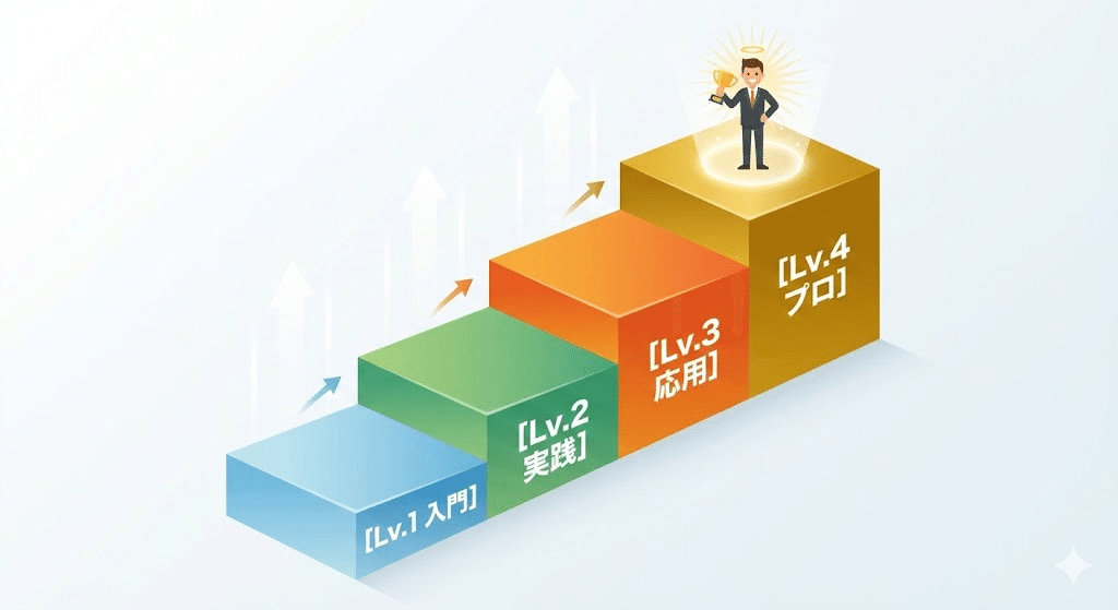
目標達成までに「どれくらいの段階」を踏む必要があるかを直感的に理解させます。
- メリット: 難しそうな工程も、ステップに分けることで「自分にもできそう」と思わせます。
- NanobananaPro Prompt:
Plaintext
* Subject: (Staircase Step Diagram with Japanese text.)
* Layout: (A series of 4 rising steps. Each step labeled: "[Lv.1 入門]", "[Lv.2 実践]", "[Lv.3 応用]", "[Lv.4 プロ]". Character icon at top.)
* Visuals: (Isometric 3D perspective steps. Color intensity increases with height. Clear, bold Japanese labels on each step face.)
* Style: (Achievement-oriented, motivational style, high-quality vector.)
12. 地図・マップ(Map Diagram)
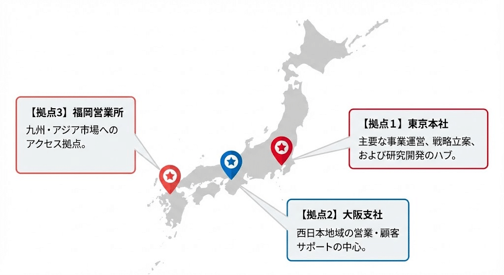
拠点やエリアを示す際に、直感的な位置関係を伝えます。
- メリット: サービスの展開規模や、物理的なネットワークの広がりを証明できます。
- NanobananaPro Prompt:
Plaintext
* Subject: (Map-based infographic showing locations with Japanese text.)
* Layout: (A simplified map of Japan/World. Pin icons placed at "[拠点1]", "[拠点2]", "[拠点3]". Each pin has a callout box.)
* Visuals: (Minimalist map design in light gray. Pin icons are vibrant red/blue. Callout boxes contain clear Japanese text.)
* Style: (Modern flat design, professional, clean layout, high resolution.)
13. パズル・ハニカム構造(Honeycomb Diagram)
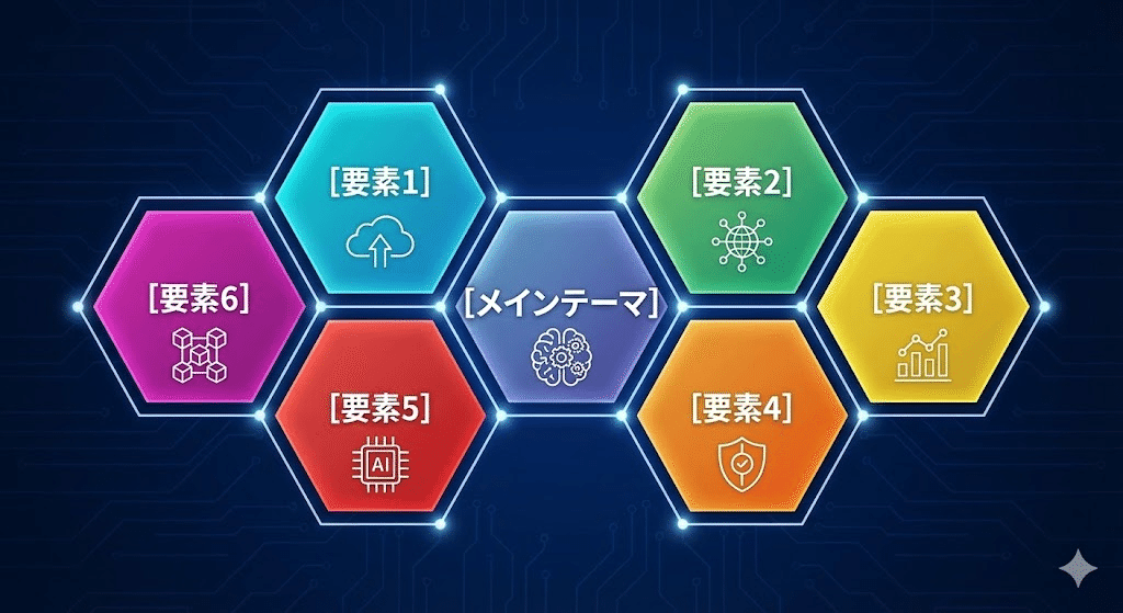
六角形を組み合わせ、要素の「拡張性」や「相互の対等性」を表現します。
- メリット: 中心と周辺の関係性を示しつつ、全体が調和している印象を与えます。
- NanobananaPro Prompt:
Plaintext
* Subject: (Honeycomb/Hexagon grid infographic with Japanese text.)
* Layout: (A cluster of 7 interlocking hexagons. Center: "[メインテーマ]", surrounding hexagons: "[要素1]" to "[要素6]".)
* Visuals: (Modern icons inside each hexagon. Subtle gradient colors. Clean connecting points between elements.)
* Style: (Tech-oriented, geometric, minimalist, high-quality Japanese typography.)
14. 相関図(Correlation Map)
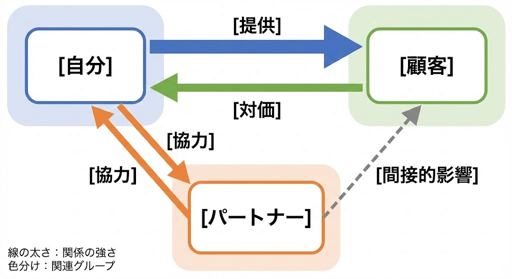
複数の要素がどう影響し合っているのか、複雑な関係を一枚に凝縮します。
- メリット: ビジネスモデル(BtoBtoC等)など、一言では説明しにくい仕組みを俯瞰させます。
- NanobananaPro Prompt:
Plaintext
* Subject: (Complex Correlation Map with Japanese text.)
* Layout: (Nodes connected by directional arrows. Arrows labeled with relationship types like "[提供]", "[対価]", "[協力]". Key players: "[自分]", "[顧客]", "[パートナー]".)
* Visuals: (Different line thicknesses to show strength. Color-coded zones to group related players.)
* Style: (Clear logical flow, professional business diagram, white background.)
15. 数式デザイン(Math Logic Design)
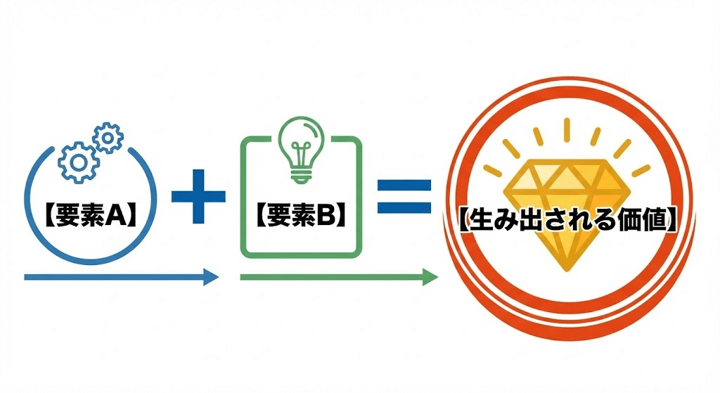
「A + B = C」という形で、シンプルなロジックや相乗効果を伝えます。
- メリット: 複雑なノウハウを「必勝の方程式」としてシンプルに定義し、記憶に残します。
- NanobananaPro Prompt:
Plaintext
* Subject: (Math equation style infographic with Japanese text.)
* Layout: (Horizontal equation: "[要素A]" + "[要素B]" = "[生み出される価値]". Use bold "+" and "=" symbols.)
* Visuals: (Each element is inside a stylized box or circle with an icon. High contrast for the final result/value.)
* Style: (Iconic, minimalist, bold fonts, clear Japanese typography.)
16. グループ図:少(Small Grouping)
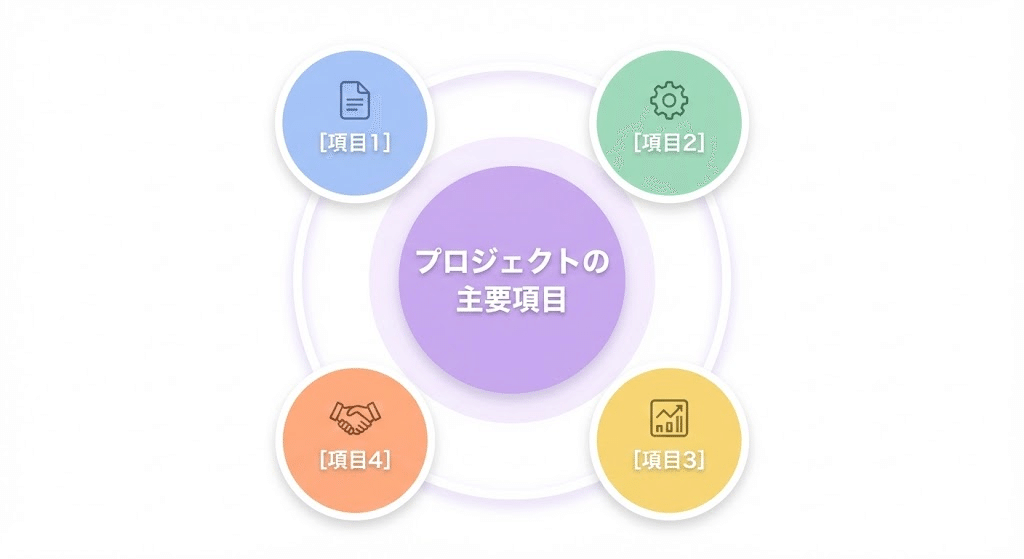
要素数が少ないときに、スッキリと整えて全体像を把握させます。
- メリット: 要素を円形に並べることで、バランスの取れた「まとまり」を感じさせます。
- NanobananaPro Prompt:
Plaintext
* Subject: (Grouped icons diagram for 3-5 elements with Japanese text.)
* Layout: (Circular arrangement of 4 circles around a central space. Labels: "[項目1]", "[項目2]", "[項目3]", "[項目4]".)
* Visuals: (Soft pastel colors. Each circle contains a high-quality icon related to the topic. Centered title in Japanese.)
* Style: (Clean UI design, modern vector, professional presentation style.)
17. グループ図:多(Large Grouping)
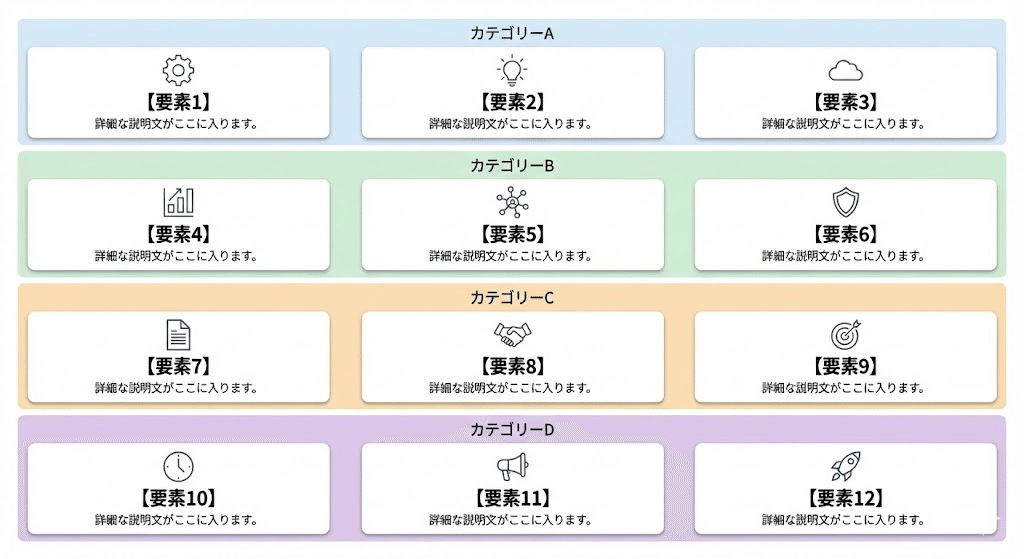
多数の要素を整然と並べ、「多さ」と「整理されている状態」を両立します。
- メリット: ロゴや実績を多数並べる際、ごちゃつかず圧倒的な「実績感」を演出できます。
- NanobananaPro Prompt:
Plaintext
* Subject: (Multi-element grid infographic with Japanese text.)
* Layout: (A structured grid layout for 12 items (3x4). Each item is a small card with a label: "[要素1]" to "[要素12]".)
* Visuals: (Uniform card design. Consistent icon style across all cards. Use background zoning to group sub-categories.)
* Style: (Clean, organized, high-density information design, white background.)
18. 規模比較図(Scale Comparison)
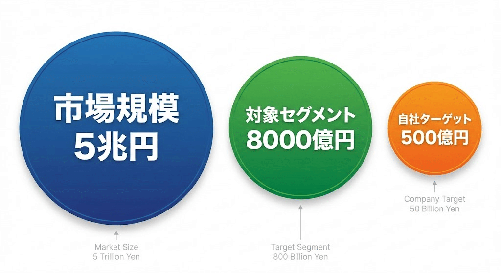
円の大きさなどで、直感的に「差」や「インパクト」を伝えます。
- メリット: 厳密な数値よりも「どれくらい凄いのか」という感覚を優先して伝えたい時に有効です。
- NanobananaPro Prompt:
Plaintext
* Subject: (Comparison of scale using circles with Japanese text.)
* Layout: (Two or three circles of different sizes side-by-side. Largest: "[市場規模A]", Smallest: "[自社ターゲットB]".)
* Visuals: (Vibrant colors for the circles. Numerical values or labels written inside or next to each circle in Japanese.)
* Style: (Impactful, bold, high-resolution vector, clear contrast.)
19. 規模分析図:TAM-SAM-SOM
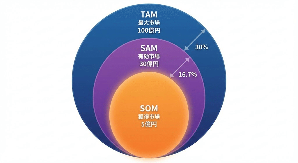
市場のポテンシャルを同心円で示し、ビジネスの将来性を証明します。
- メリット: 投資家やパートナーに対し、狙うべき市場の解像度をアピールできます。
- NanobananaPro Prompt:
Plaintext
* Subject: (TAM-SAM-SOM Market Analysis infographic with Japanese text.)
* Layout: (Three concentric circles. Outer: "[最大市場]", Middle: "[有効市場]", Inner: "[獲得市場]".)
* Visuals: (Gradient overlays. Innermost circle is highlighted with a glow or vibrant color. Percentage text added.)
* Style: (Clean, professional, high-end corporate style.)
20. 階層・レイヤー図(Layered Diagram)
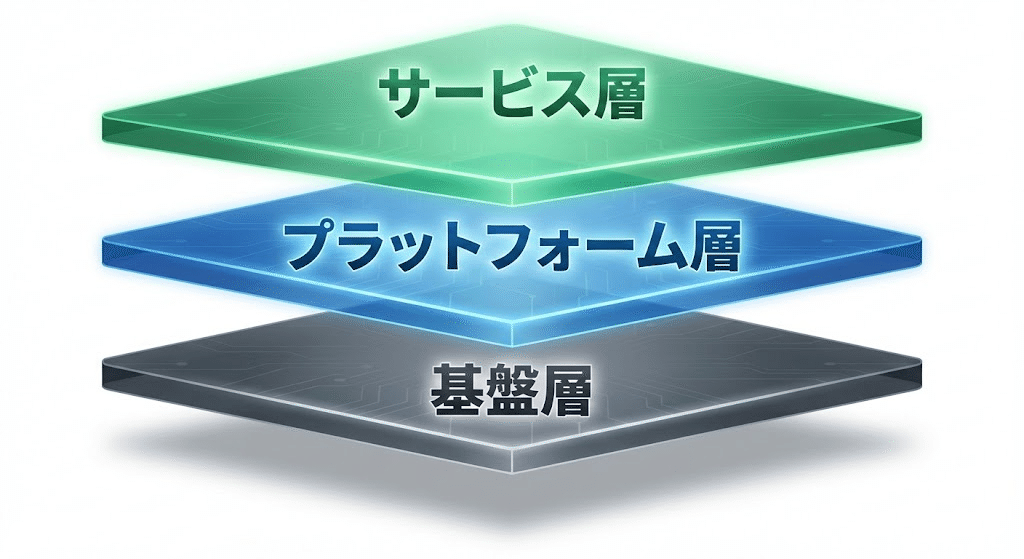
業界の土台やサービスの基盤となるレイヤー構造を示します。
- メリット: どの基盤の上に、どの価値が成り立っているのかを構造的に理解させます。
- NanobananaPro Prompt:
Plaintext
* Subject: (3D Layered stack infographic with Japanese text.)
* Layout: (Vertical stack of 3 isometric planes. Top: "[サービス層]", Middle: "[プラットフォーム層]", Bottom: "[基盤層]".)
* Visuals: (Soft shadows between planes. Semi-transparent colors. Bold Japanese text on the side of each layer.)
* Style: (Sleek, futuristic, high-end design, high resolution.)
21. トライアングル図(Triangle Diagram)
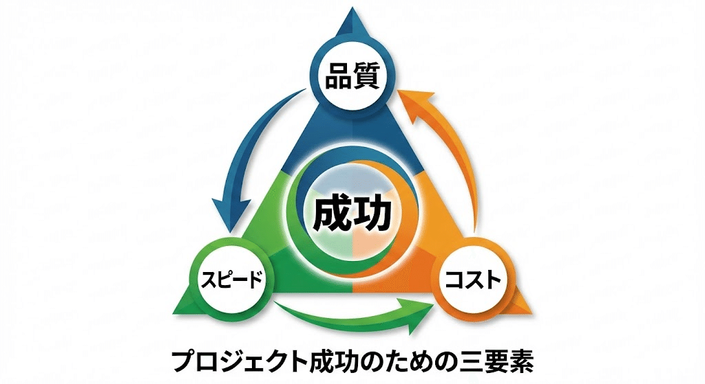
3つの要素が互いに影響し合い、1つの目的を形作っていることを示します。
- メリット: 「三位一体」という非常に強固で安定したイメージを与えられます。
- NanobananaPro Prompt:
Plaintext
* Subject: (Triangle/Trinity diagram with Japanese text.)
* Layout: (Equilateral triangle with an element at each vertex: "[要素1]", "[要素2]", "[要素3]". Center label: "[成功]".)
* Visuals: (Arrows connecting the vertices to show mutual influence. Each corner has a distinct theme color.)
* Style: (Bold, iconic, professional Japanese typography.)
22-24. 箇条書きデザイン三種(List Designs)
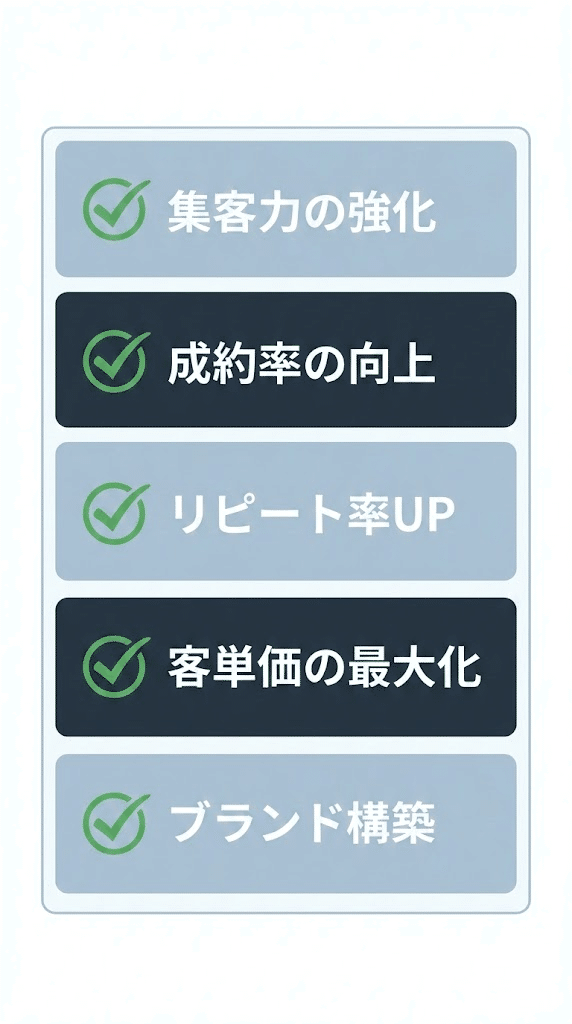
「縦」「横」「羅列」を使い分け、情報のスキャン性を劇的に高めます。
- メリット: テキストを「読む」ストレスを排除し、必要な情報を「見つける」体験に変えます。
- NanobananaPro Prompt:
Plaintext
* Subject: (Stylized List design with Japanese text.)
* Layout: (Select one: Vertical List / Horizontal Grid / Dense Array. Items: "[項目1]" to "[項目5]".)
* Visuals: (Modern checkmark icons. Alternating light/dark backgrounds for rows. High-contrast labels.)
* Style: (Clean UI design, professional sans-serif, easy-to-read layout.)
第3部:AI図解を「資産」に変える究極のワークフローと、あなたへの贈り物
ここまで、24種類におよぶ図解の構造と、それを制御するための「NanobananaPro」プロンプトを公開してきました。
しかし、プロンプトを手に入れることは、いわば「最高の設計図」を手に入れたに過ぎません。
最後に、この設計図を使って「実際に美しい図解を生成し、ビジネスの武器にするための具体的な手順」、そして私が開発した「究極の自動化ツール」についてお話しします。
「設計図」を「完成品」に変える3ステップ
NanobananaPro形式のプロンプトを、ChatGPT(DALL-E 3)やGemini、Midjourneyなどの画像生成AIに流し込む際、以下のフローを意識することで、クオリティはさらに跳ね上がります。
- コンテキストの付与
- いきなりプロンプトを打つのではなく、「あなたはプロのインフォグラフィックデザイナーです。今から渡す構造指示に基づき、ビジネス資料で使える清潔感のある図解を作成してください」と一言添えるだけで、AIの出力モードが切り替わります。
- 英語による「空間指示」の微調整
- もし文字が少し崩れたり、色がイメージと違ったりした場合は、「Keep the layout, but change the theme color to orange.」のように、英語で指示を足してください。これが「構造を英語で記述している」NanobananaPro最大のメリットです。
- デザインツールでの最終仕上げ
- AIが作った図解は、そのまま使うのも良いですが、CanvaやFigmaに取り込んでロゴを足したり、フォントを微調整したりすることで、完全に「あなたのオリジナルコンテンツ」へと昇華します。
「プロンプトを打つことすら、もう不要です」
ここまで読んでくださったあなたなら、図解がいかに強力な武器になるか、そしてその生成には「正しい構造指示」が不可欠であることを理解していただけたはずです。
しかし、同時にこうも思ったのではないでしょうか?
「24種類も使い分けるのは大変そうだし、毎回プロンプトを組むのは面倒だ……」
その悩み、私が解決しました。
私は、今回ご紹介した全パターンの「NanobananaPro」ロジックをすべて学習させ、どんなテーマを投げても一瞬で最適な図解構造を生成する、専用のチャットボット「図解特化型Gems」を開発しました。
あなたがやることは、「何を伝えたいか」を日本語で入力するだけ。
あとはこのGemsが、最適な図解パターンを選定し、そのまま画像生成AIに使える「完璧なプロンプト」を自動で書き出します。
【限定配布】「図解特化型Gems」を受け取ってください
この「図解特化型Gems」は、私が運営する株式会社スターストリーム・スタジオで、実際にプロの出版プロデュースやコンテンツ制作の現場で使用している技術を凝縮したものです。
本来、一般公開する予定はありませんでしたが、ここまで熱心に「AIでのスキルアップ」を志すあなたに、ぜひ使っていただきたい。
以下の公式LINEに登録していただいた方に、「図解特化型Gems」を無料でプレゼントします。
▼ 公式LINEに登録して「図解特化型Gems」を無料で受け取る
終わりに:AIを「脳の拡張」にするために
私は、元薬剤師という全く異なる業界からAIの世界に飛び込みました。その中で確信したのは、「AIを使いこなす側」と「AIに使われる側」の差は、技術への理解度と、それを形にする仕組み(システム)を持っているかどうかで決まるということです。
今回の記事と、私が提供するGemsが、あなたのビジネスを加速させ、より多くの人に価値を届けるための「翼」になれば幸いです。
共に、AIという強力な相棒と共に、新しい景色を見に行きましょう。